Arketype
Calm spaces, shaped around the way people really live.
- Client
- Arketype
- Year
- 2026
- Industry
- Interior design
- Services
- Brand positioning, Logotype, Brand identity, Art direction, Stationery & merch
A young interior design studio with a stacked logotype, a forest-green palette and one line to live by: space starts with people.
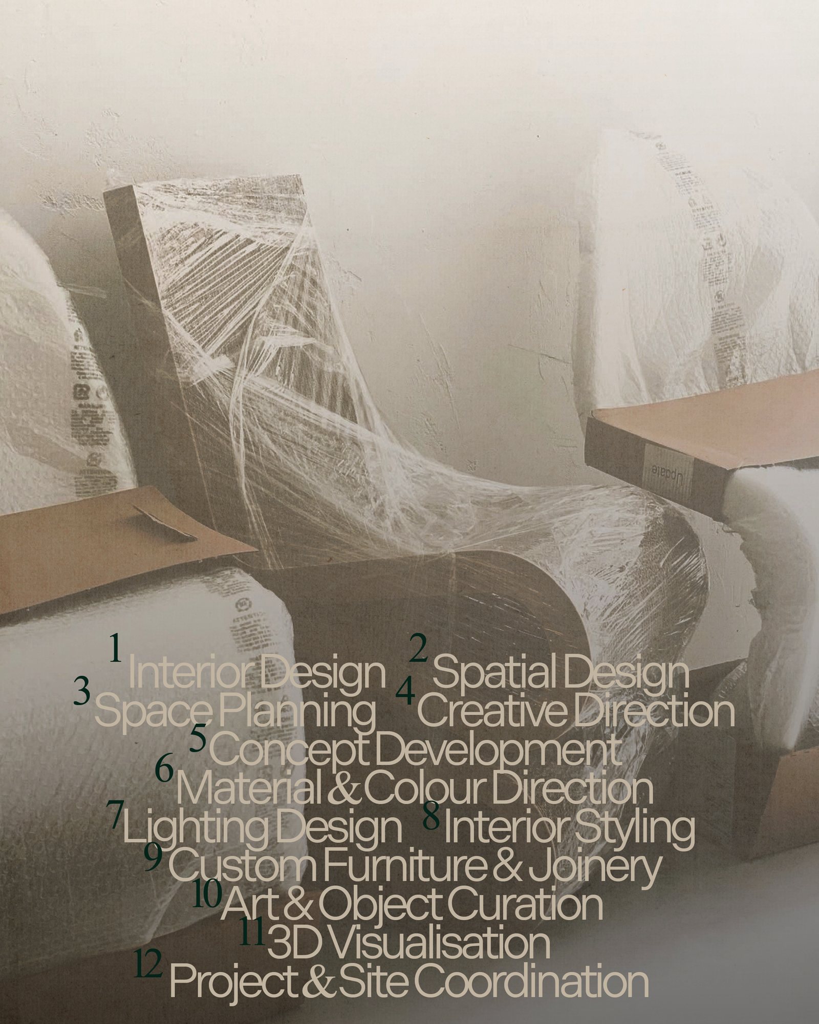
Arketype is a contemporary interior design studio based in Lille. It shapes calm, structured spaces around the way people really live, from a single apartment to a complete project, including joinery, lighting and objects.
It is a self-initiated brief, built as if the studio were opening tomorrow. The scope covers the positioning, the logotype, the visual identity and the art direction that carries it from posters to project sheets and everyday objects.
Interior design studios tend to look the same: beige palettes, thin serif logos and photographs of empty, perfect rooms. They look expensive but distant, and say little about the people who actually live there.
The challenge: a young studio that feels warm and contemporary, calm without being cold, and that puts people before the decor.
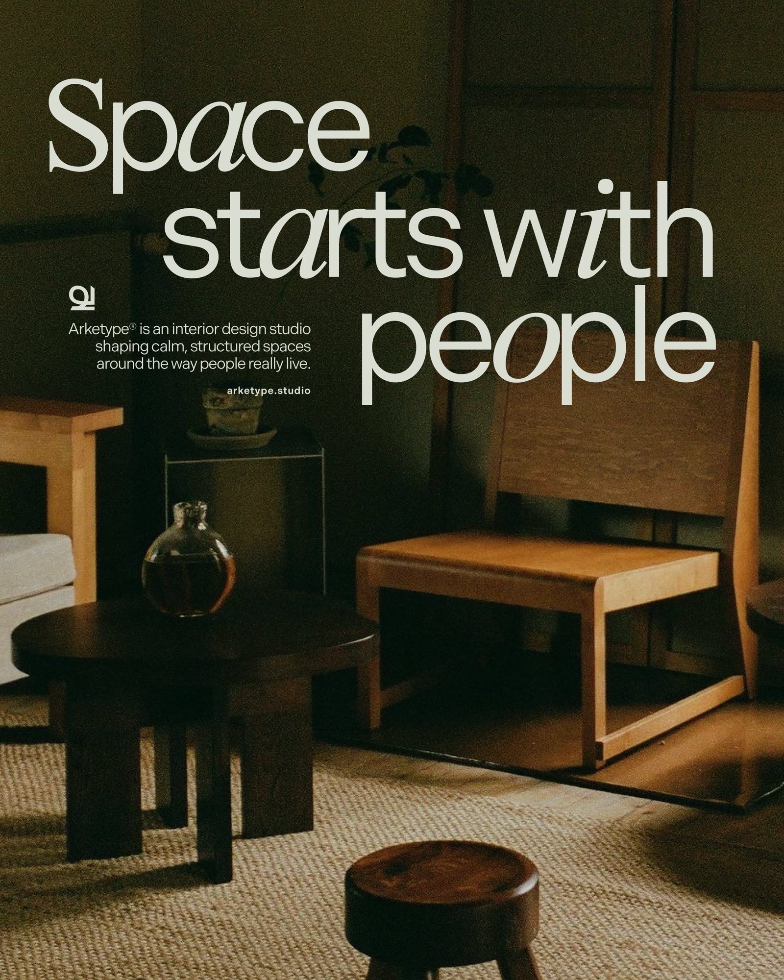
The positioning starts from one idea: space starts with people. Arketype designs around daily life, light, circulation and the objects its clients want to keep, not around a style.
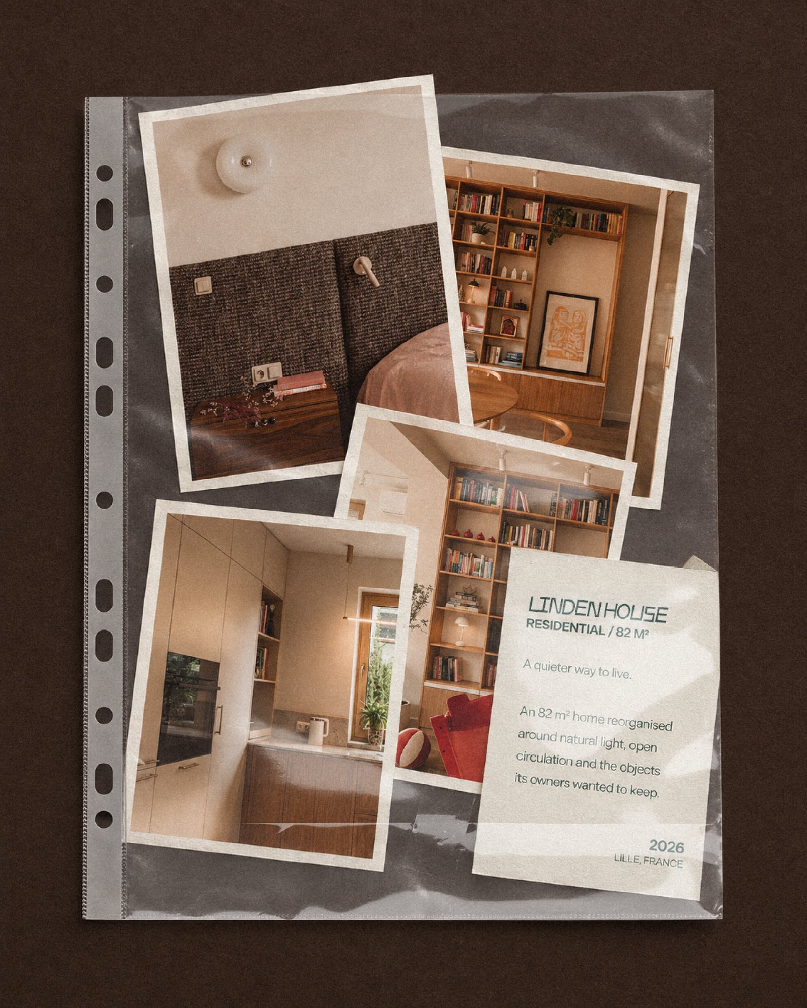
The tone follows: short, quiet and confident. Each project is told like a small story, with a line, a scale and a place, never like a catalogue.
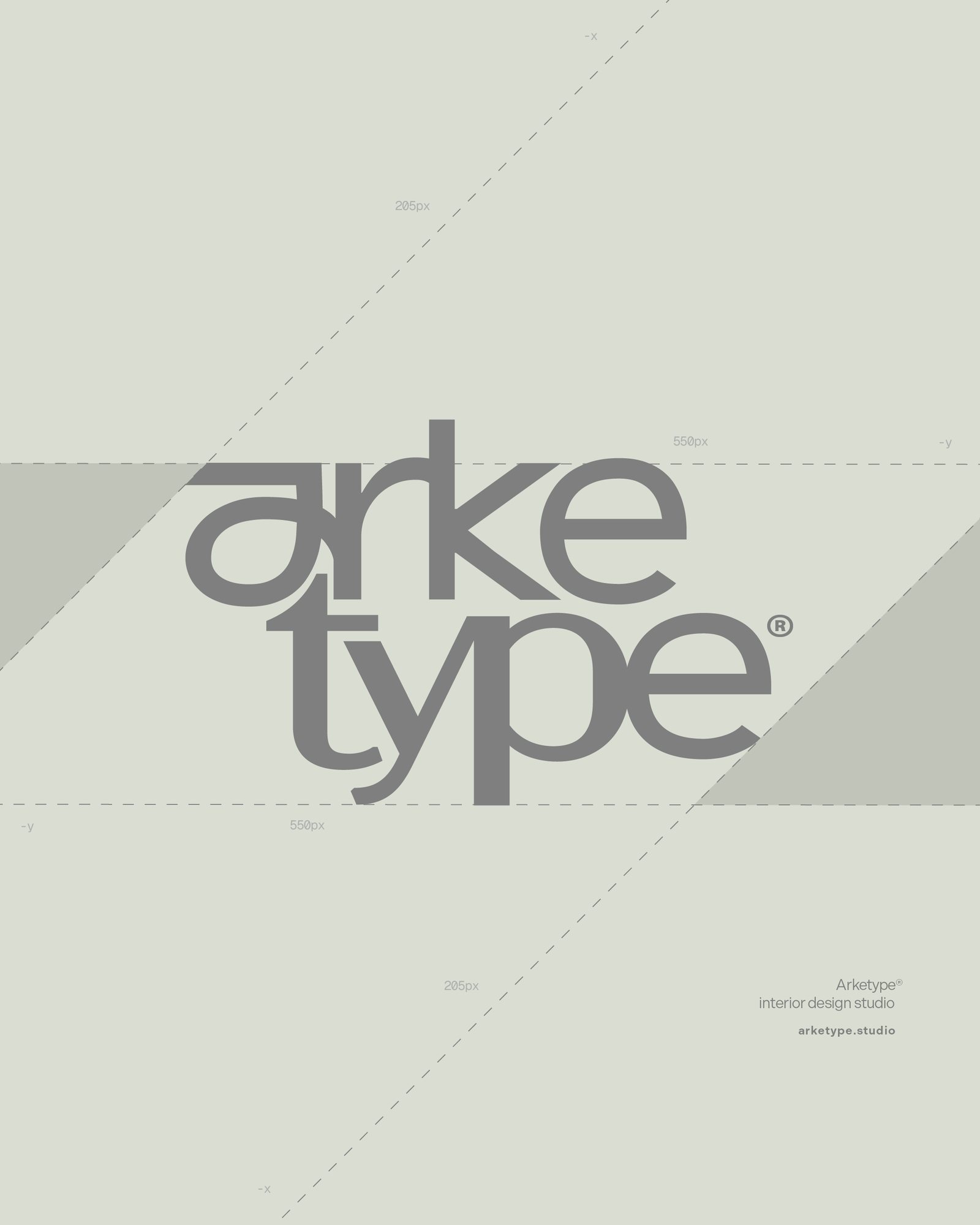
The logotype is wide, lowercase and tightly set. The letters of arke and type lock together on two lines, with the y dropping below the baseline like a signature. A small monogram completes the system for tight spaces and details.
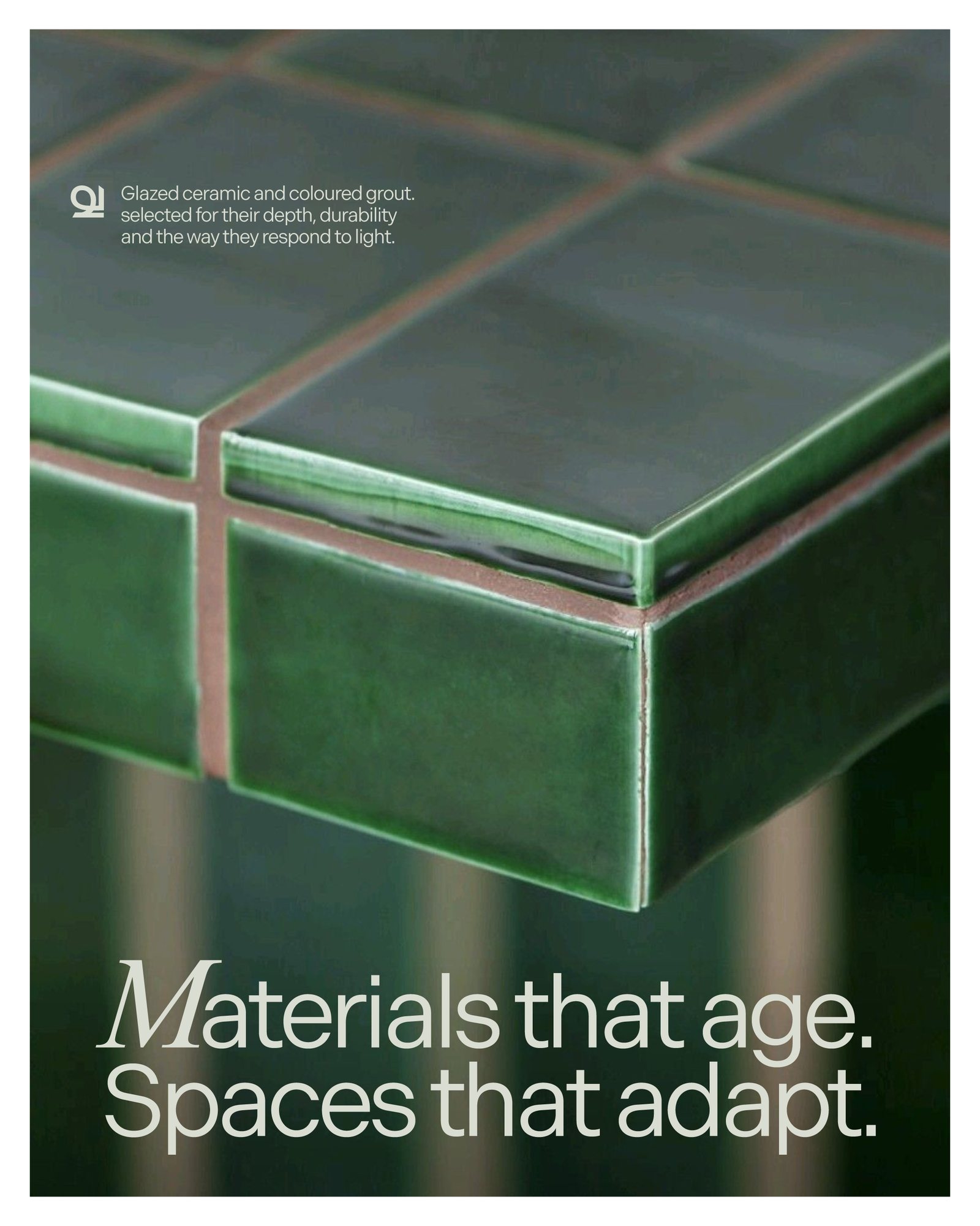
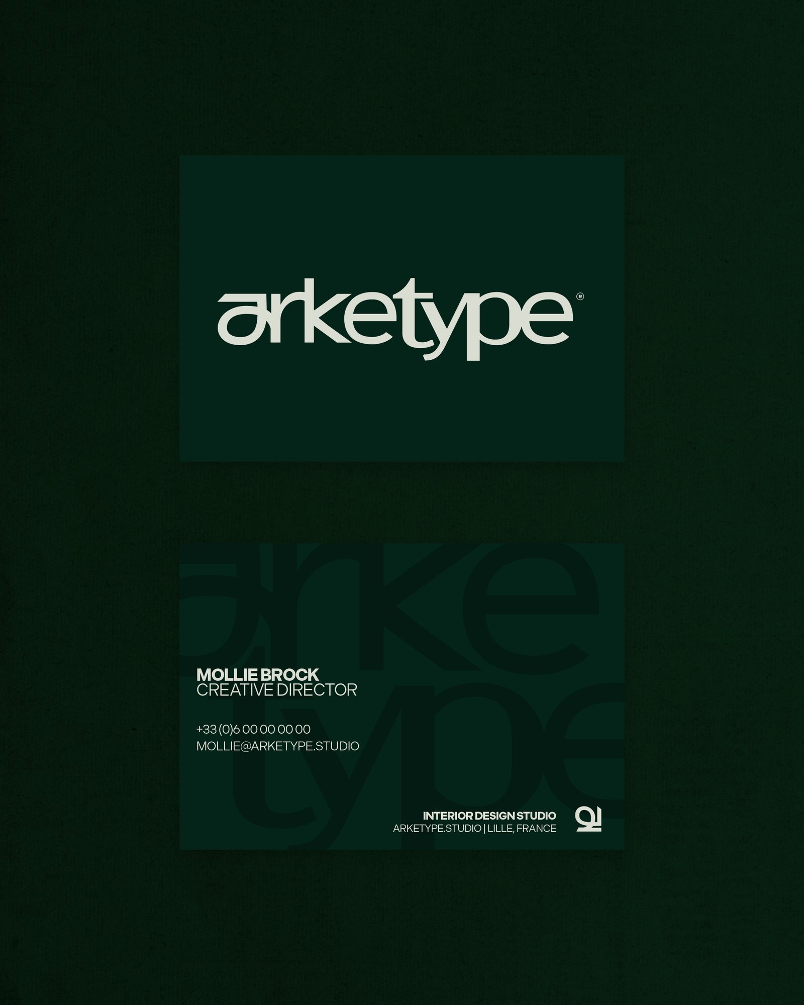
A deep forest green and a soft sage white carry the palette, warmed by the terracotta and brown of the photography. Headlines mix a clean grotesk with italic serif letters set inside the words, a nod to craft within a modern frame.
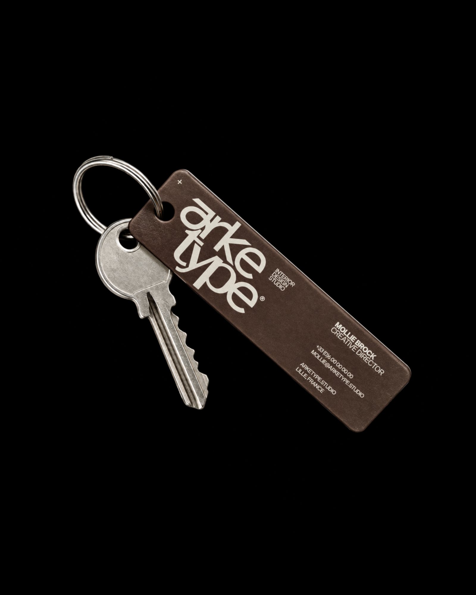
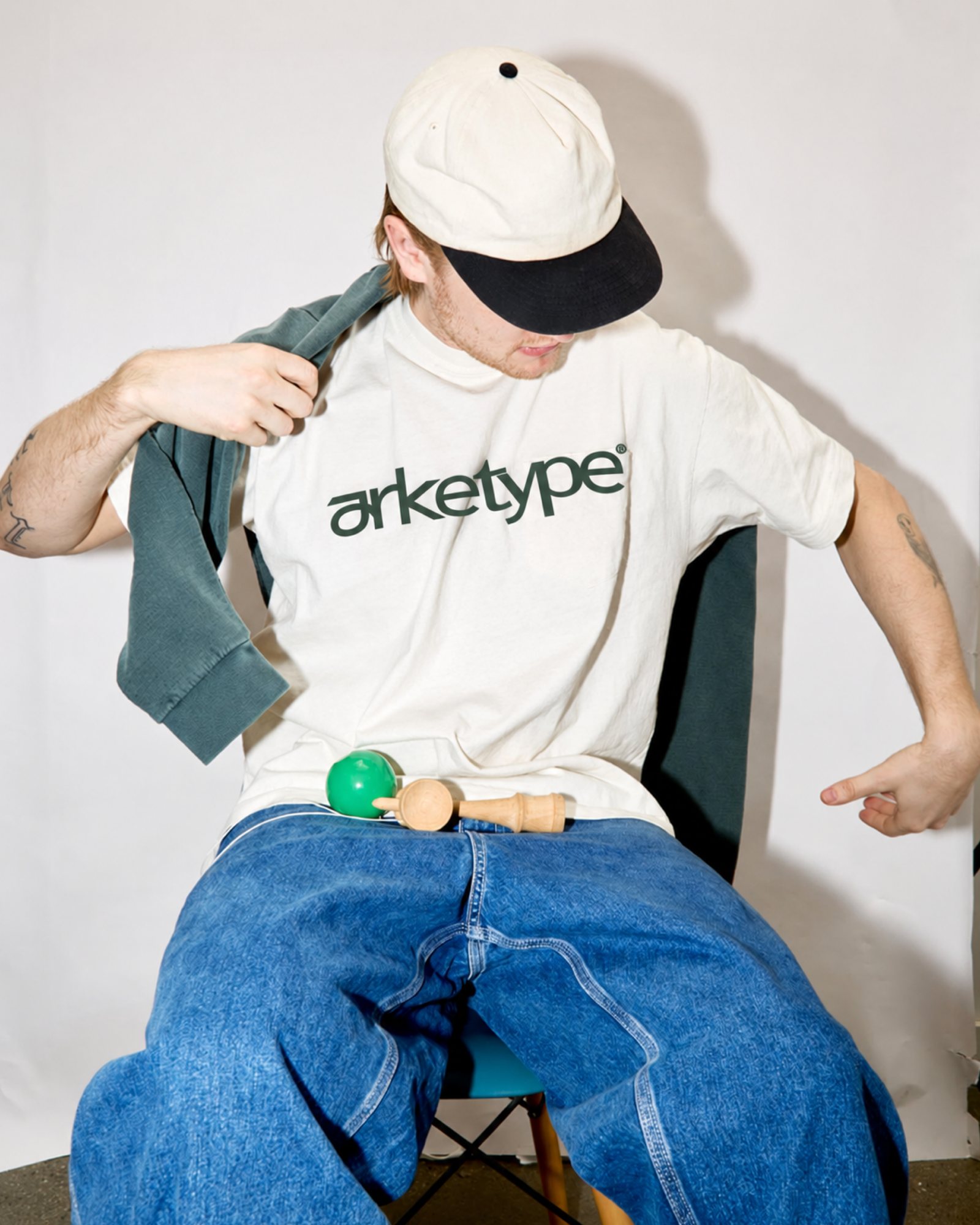
The identity lives on objects as much as on screens: a leather key tag, business cards on green paper, a tee, and project sheets slipped into plastic sleeves like an architect’s binder.
- 01Brand positioning
- 02Logotype & monogram
- 03Colour palette & typography
- 04Art direction
- 05Social media visuals
- 06Project sheets
- 07Business cards
- 08Key tag
- 09Merch
A studio identity that feels as lived-in as the interiors it designs: recognisable from the first letter, calm on every format, and consistent from a poster to a key tag.
One logotype, one green, one line: space starts with people.