HNY
Not your sweet honey.
- Client
- HNY
- Year
- 2026
- Industry
- Food & drink
- Services
- Brand identity, Logotype, Packaging, Art direction, Photography
A Mānuka honey brand that drops the wellness talk, with a logotype poured like honey, a dark label and one clear line.
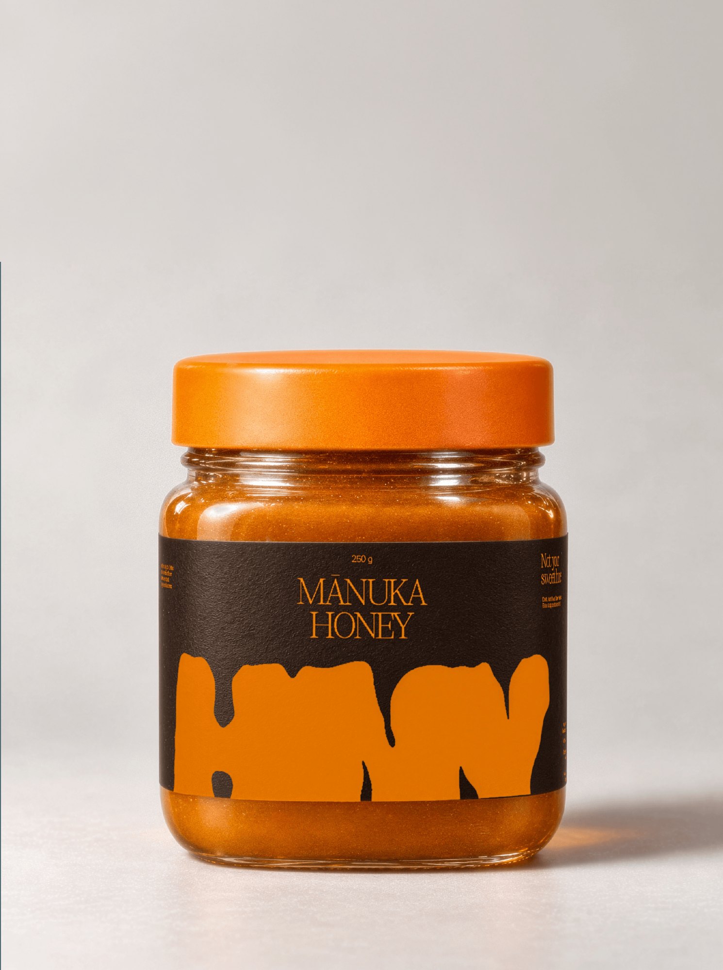
HNY is a Mānuka honey from New Zealand: dark, thick, slightly bitter, harvested from wild mānuka bush and jarred raw (250 g, MGO 514+). It is a self-initiated brief, designed in a single day as if the brand were launching tomorrow.
The scope covers the logotype, the jar label, the campaign art direction and the visuals around it.
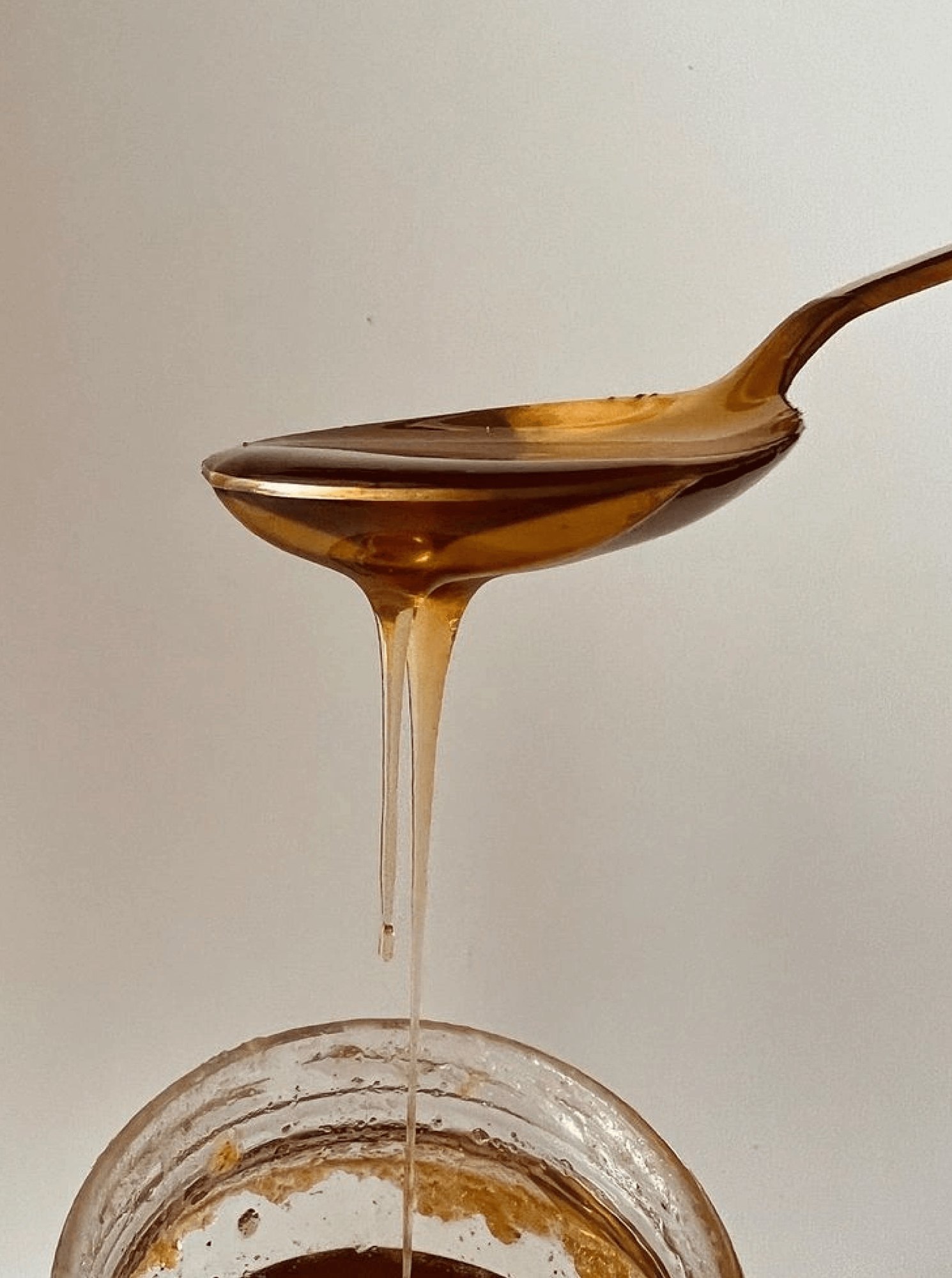
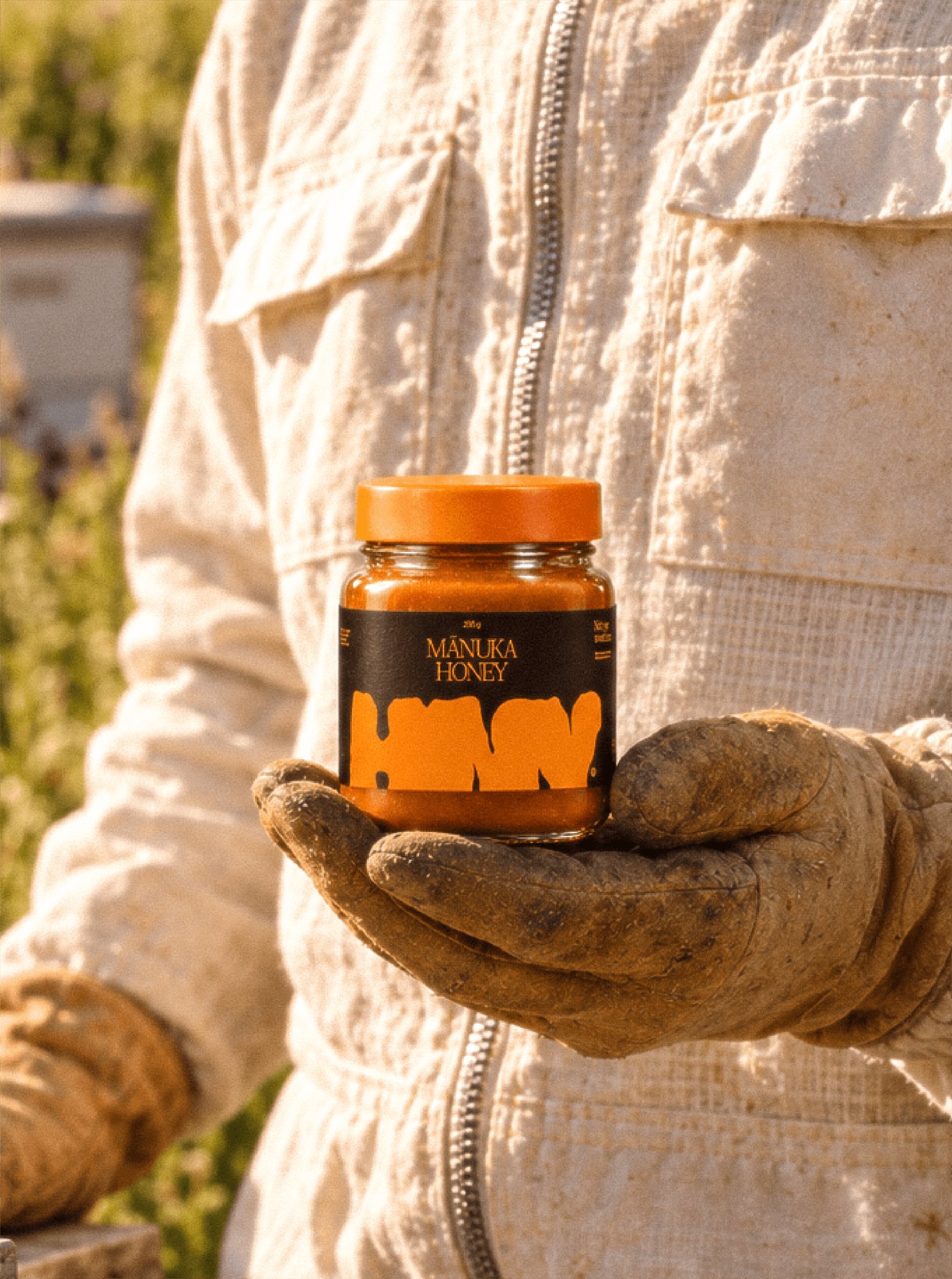
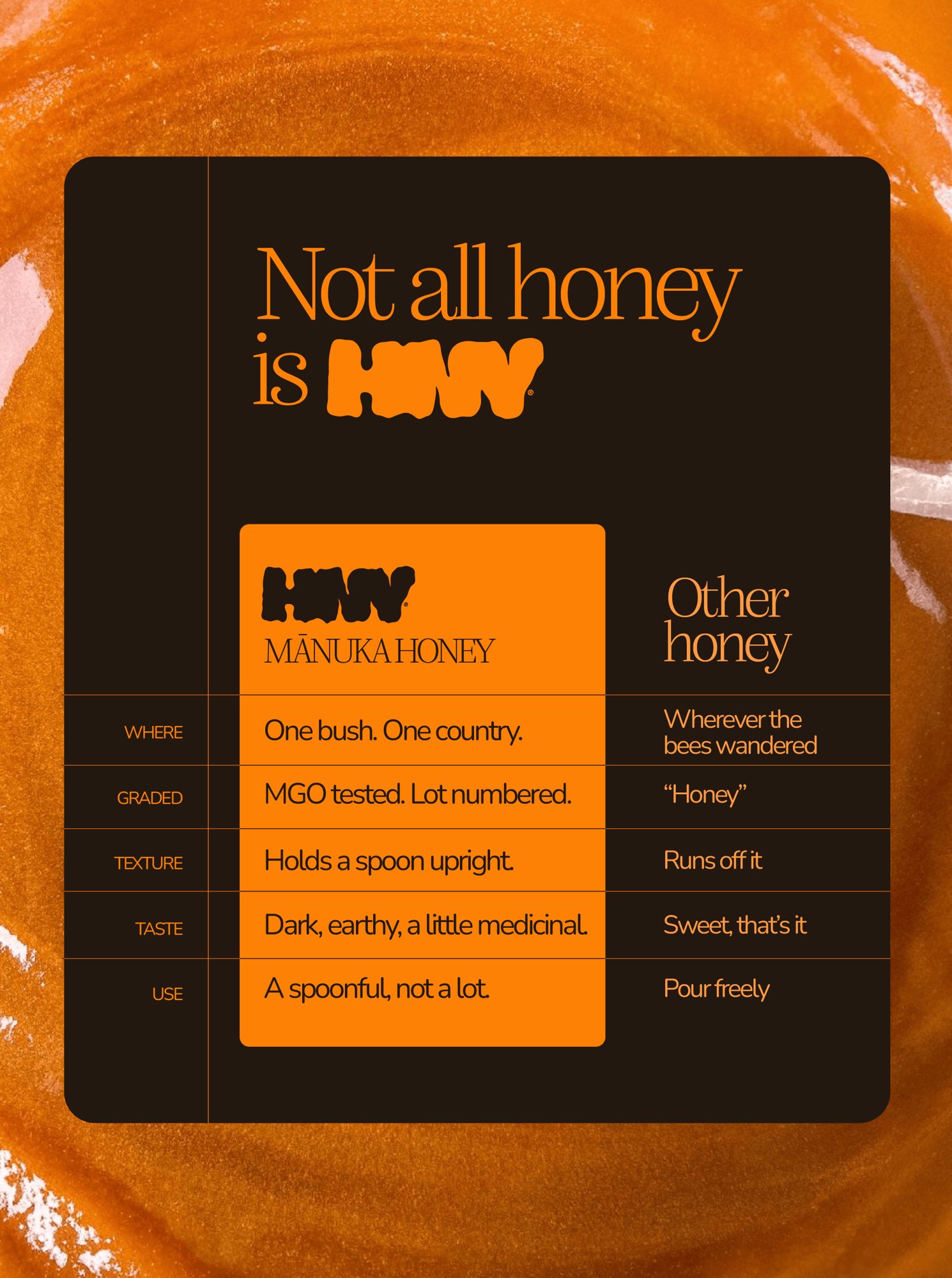
Most honey brands look the same: golden yellow, bees, flowers, and a lot of wellness promises. Mānuka honey is nothing like that. It is dark, earthy, a little medicinal, and meant to be taken by the spoonful, not poured freely.
The challenge: make a honey that stands apart from the shelf of sweet jars, without borrowing the codes of health products.
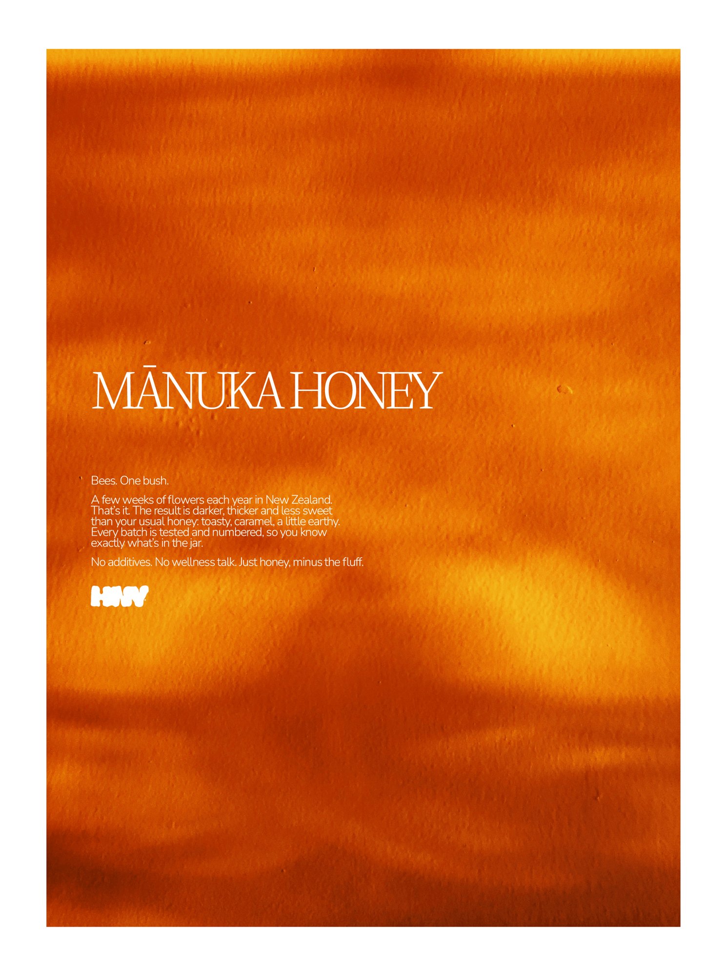
Be honest about what the product is. HNY says it plainly: not your sweet honey. Every batch is tested and numbered, one bush, one country, and the tone stays direct, with no additives and no wellness talk.
The comparison does the selling: where other honey is sweet and runs off the spoon, HNY holds it upright.
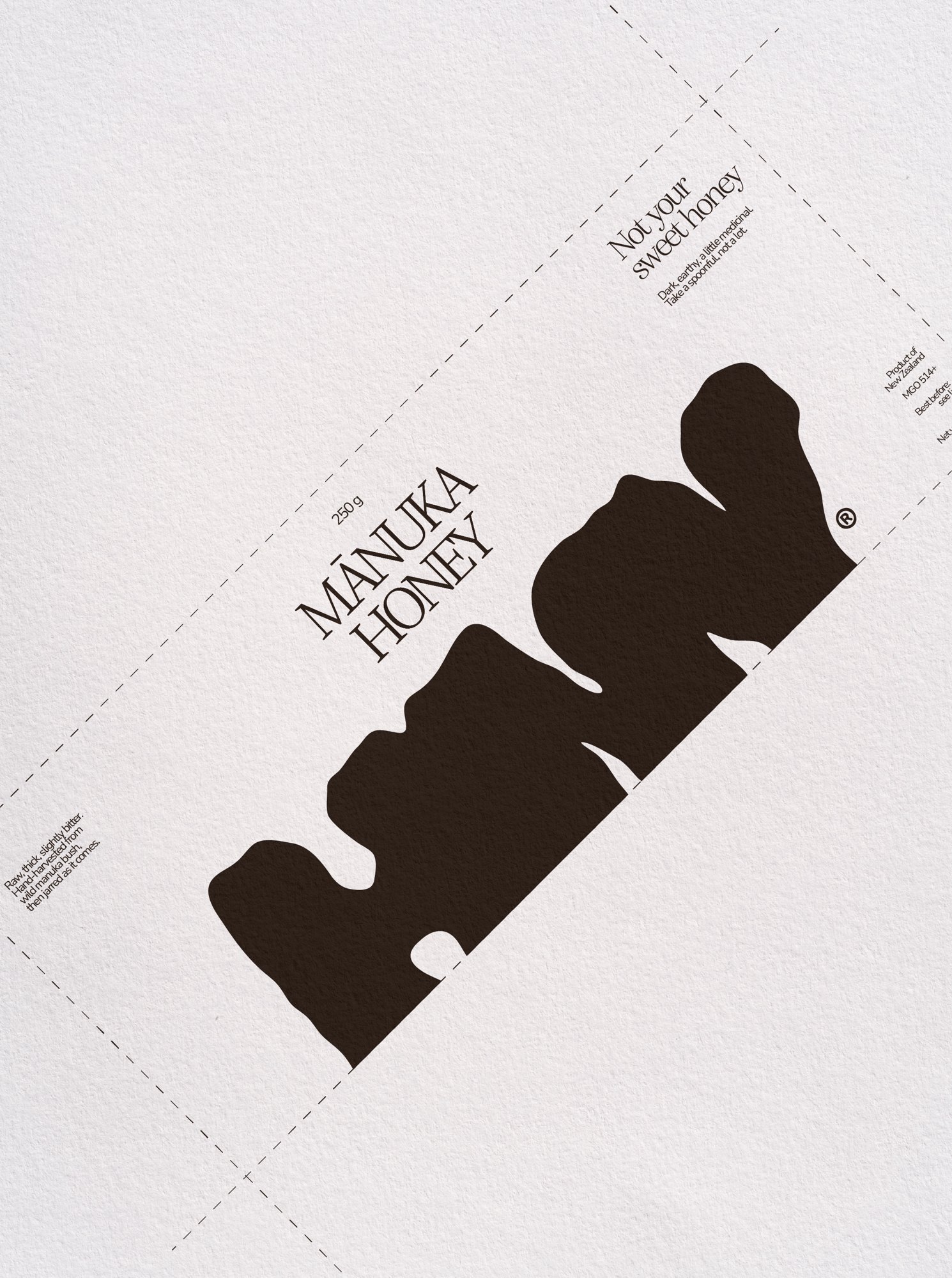
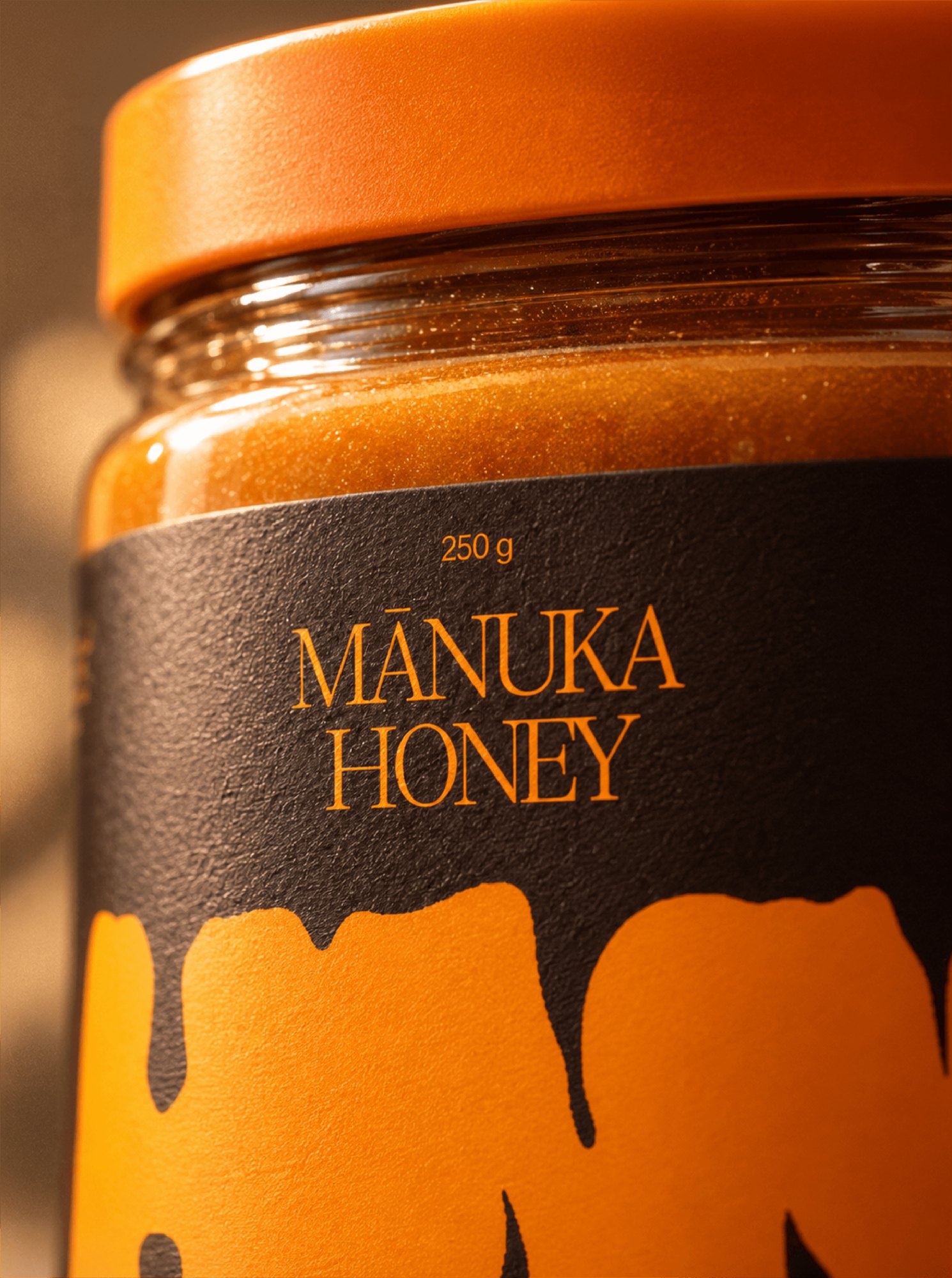
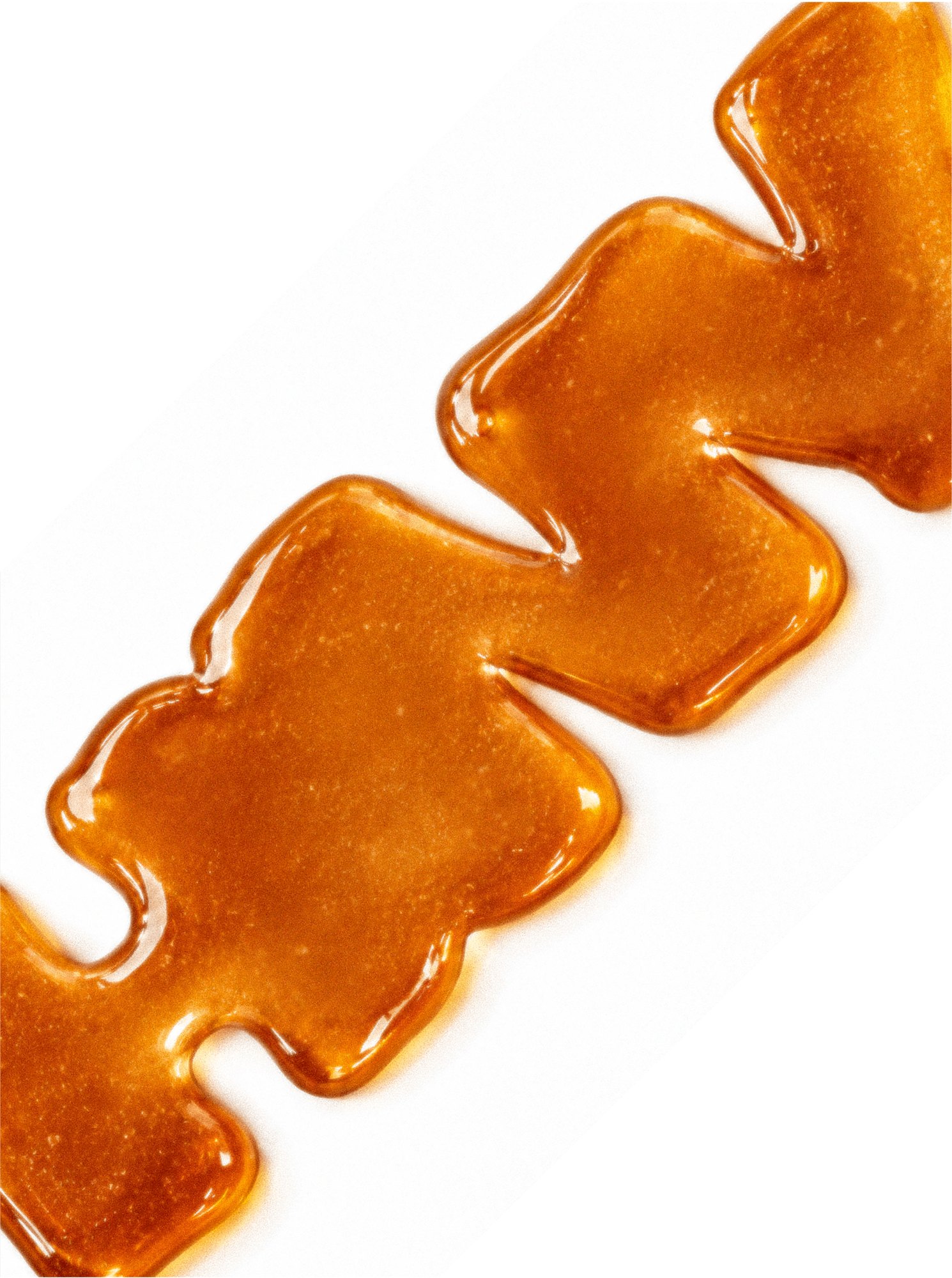
The logotype is drawn as if poured: heavy, rounded, uneven letters that melt into each other like honey on a spoon. On the label it drips down from the top, set against a deep brown paper, with the product name in a fine serif.
Two colours do all the work: a dark brown and a strong honey orange, repeated on the label, the lid and every piece of communication. The photography stays warm and tactile, from the spoon and the jar to the beekeeper's gloves.
- 01Logotype
- 02Jar label
- 03Campaign art direction
- 04Poster
- 05Comparison visual
- 06Photography
A honey brand with a clear point of view: recognisable from a single drip of orange on dark, and honest about what is in the jar.
One logotype, two colours, one line, and a shelf presence that looks nothing like the honey next to it.