Yuzu
A sparkling citrus drink with a colour for every flavour.
- Client
- Yuzu
- Year
- 2026
- Industry
- Food & drink
- Services
- Brand identity, Logotype, Packaging, 3D packshots, Photo & video
A sparkling alcoholic citrus drink with a tall logotype and one gradient per flavour, designed to look as fresh as it tastes.
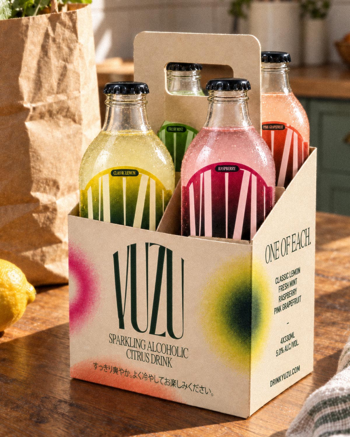
Yuzu is a sparkling alcoholic citrus drink (33 cl, 5% ABV) in four flavours: Classic Lemon, Fresh Mint, Raspberry and Pink Grapefruit. It is a self-initiated brief, built as if the brand were launching tomorrow.
The scope covers the whole brand: logotype, bottle labels, a four-pack, and the photography and 3D packshots to launch it.
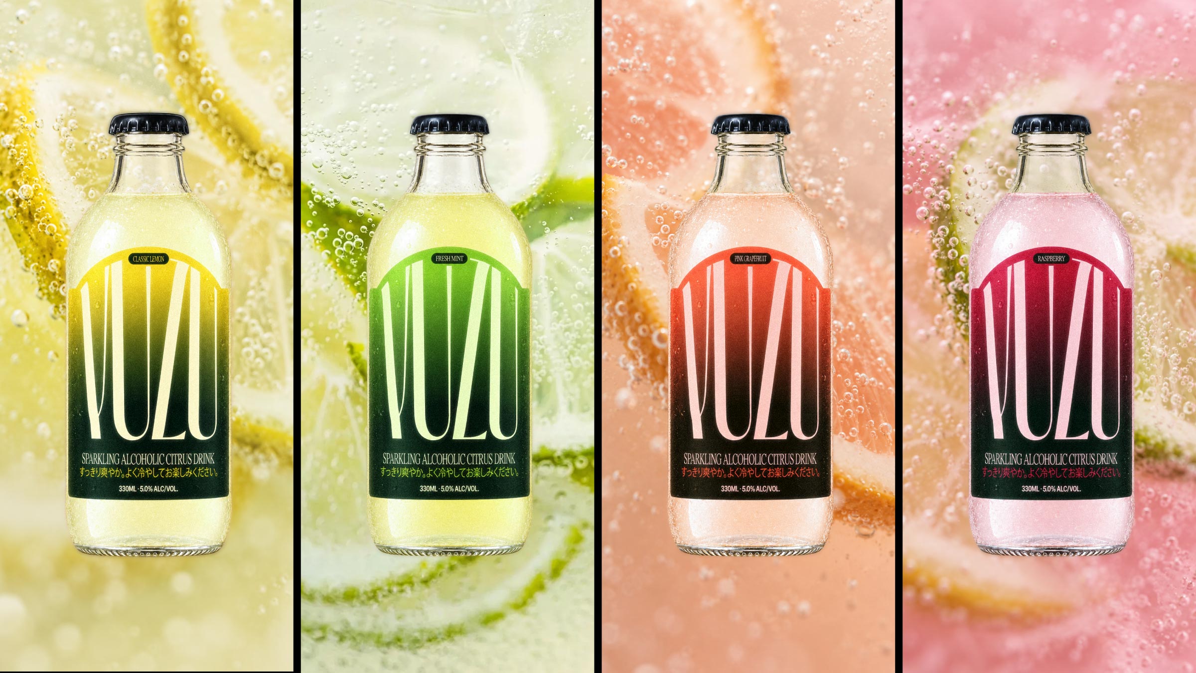
Citrus drinks tend to look alike: fruit on white, neon colours, the same summer clichés as every other can in the fridge. Four flavours also have to feel like one family, without turning into four different products.
The challenge: a label that stays instantly recognisable across the range, and still gives each flavour its own personality.
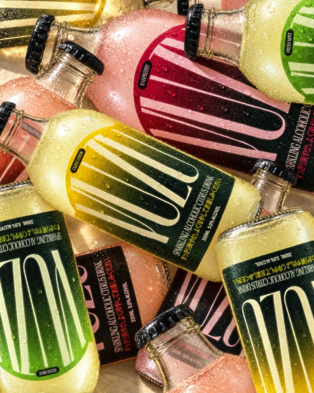
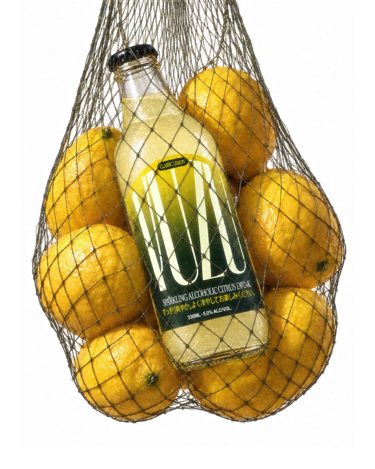
One brand, four moods. The logotype never changes; the flavour is carried by colour alone, so the shelf reads as a single family and each bottle still has its own identity.
The name and a short line of Japanese on every label nod to the fruit's origins, without leaning on cliché imagery. The drink is meant to be shared, so the pack is built around one idea: one of each.
A tall, narrow logotype fills the full height of the label, set on a deep green panel. Behind the lettering, a gradient changes with each flavour: from lemon yellow to green, from fresh mint to pale lime, from raspberry red to pink, from grapefruit orange to peach.
The four-pack uses a natural cardboard carrier with soft colour blooms that echo the four flavours, and a simple line: one of each.
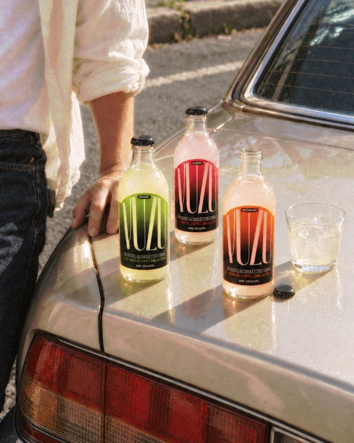
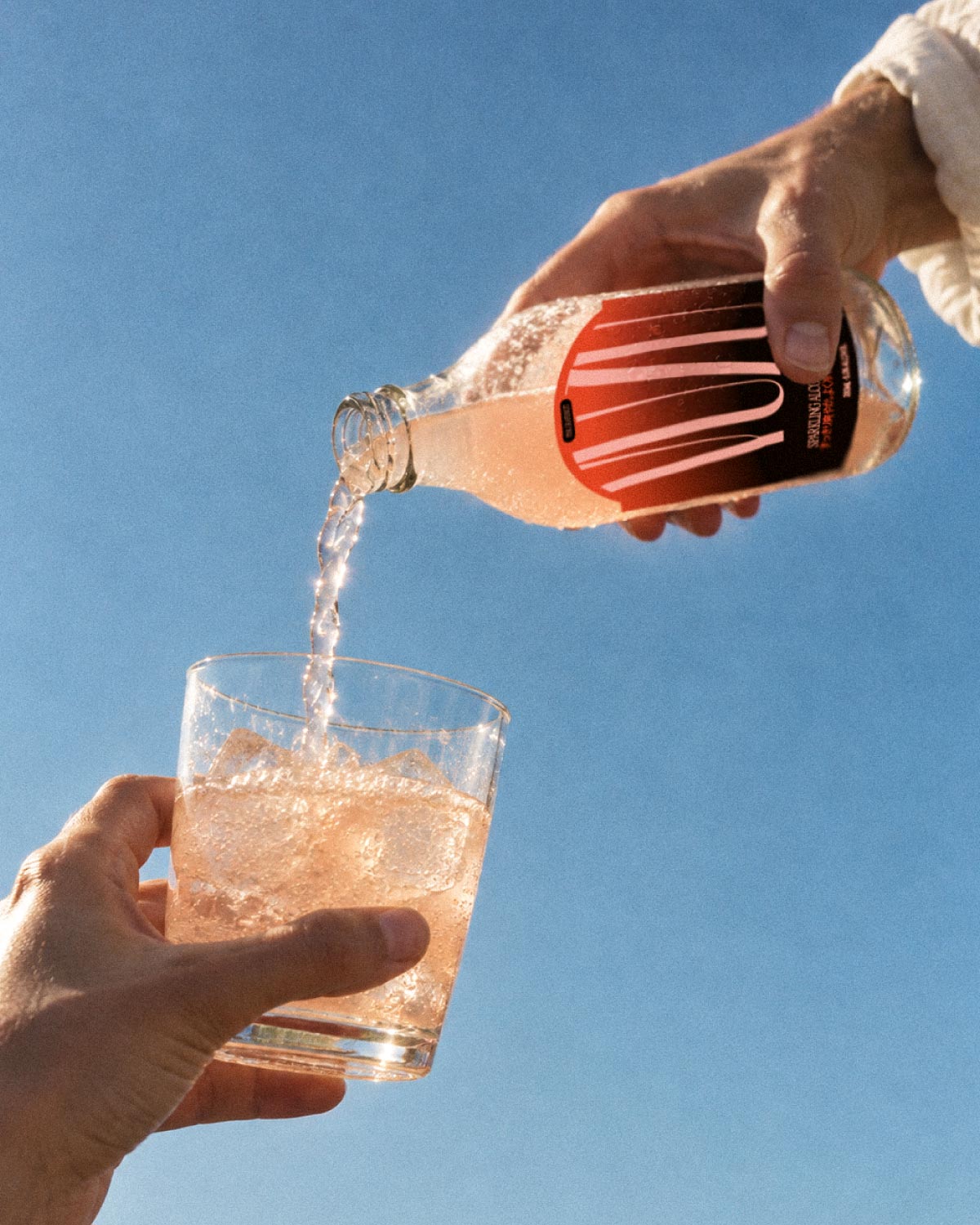
The campaign stays warm and natural: bottles in lemon nets, on the bonnet of an old car, poured in the sun.
- 01Logotype
- 02Bottle labels
- 03Four-pack
- 043D packshots
- 05Photo & video
A complete drinks brand, ready to launch: four bottles, a shareable four-pack and a photographic world that feels as fresh as the product.
One logotype, four gradients, and a range that is recognisable from across the room.